How Can Creative Website Design Boost Your Brand’s Image?
Unleash the Power of Aesthetics in Building Your Brand Online
Have you ever wondered how people perceive your brand in the vast landscape of the internet? In today’s digital age, a brand’s online presence is paramount. Your website is often the first glimpse into your world that potential customers get. It’s where the initial connection is made, the first impression formed. This is why creative website design is not just about aesthetics; it’s a powerful tool for shaping and enhancing your brand’s image. In this blog post, we’ll explore how a thoughtfully designed website can significantly impact your brand’s perception, trustworthiness, and overall success.
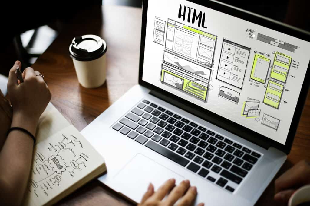
What is Creative Website Design?
Creative website design combines aesthetics and functionality to craft a digital platform that engages and captivates. It’s about using colors, typography, imagery, and layout to tell a story, convey brand identity, and create a memorable user experience. Creative design isn’t just about making a website look visually appealing; it’s about strategically using design elements to evoke emotions, establish trust, and effectively communicate your brand’s essence. Creative website design is the gateway to leaving a lasting mark on your audience in a world where first impressions matter.
The Impact of First Impressions
In the digital realm, first impressions happen in seconds, and your website is often the gateway to your brand. How your website looks and feels can differ between visitors staying to explore or clicking away. Creative website design plays a pivotal role in crafting that vital first impression. It sets your brand’s tone, communicates professionalism, and piques curiosity. A well-designed website captures attention and conveys that your brand is modern, trustworthy, and worth exploring further. First impressions in the digital world are make-or-break moments, and creative design can tip the scales in your favor.
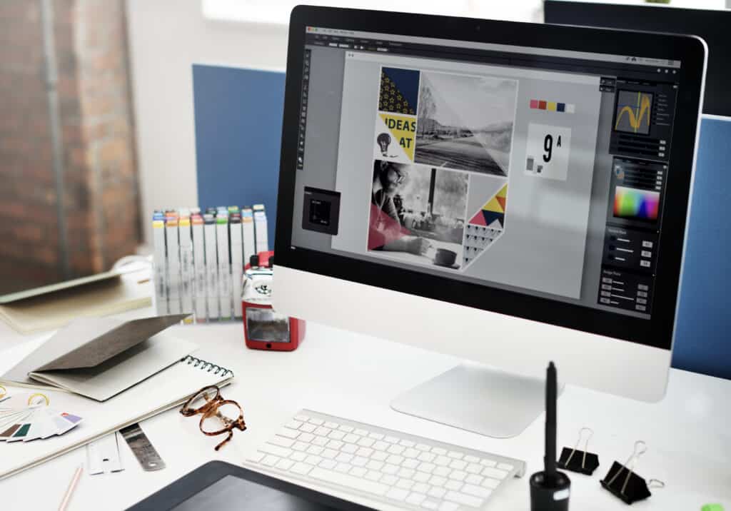
The Elements of Creative Website Design
Creative website design involves a multi-faceted approach that harmoniously combines various elements to create a seamless and engaging user experience. Let’s break down the key components that constitute creative website design:
- Visual aesthetics and branding: Visual elements, such as color schemes, fonts, and graphics, play a significant role in conveying your brand’s identity. Creative design ensures that these elements are visually appealing and align with your brand’s personality and message.
- User interface (UI) and user experience (UX): The user interface refers to how users interact with your website. In contrast, user experience relates to how they feel during and after the interaction. Creative design focuses on creating an intuitive, user-friendly interface that guides visitors smoothly through the site, ultimately leaving them with a positive and memorable experience.
- Content layout and presentation: Effective content layout is about presenting information in an organized and visually appealing manner. Creative design ensures that your content is easy to read and navigate, with attention to the information hierarchy to keep visitors engaged.
- Navigation and accessibility: User-friendly navigation is critical to creative website design. Clear menus, intuitive navigation paths, and a well-structured layout ensure that visitors can effortlessly find what they’re looking for. Accessibility, too, is essential, making the website usable for all, including those with disabilities.
- Responsiveness and mobile-friendliness: Responsive design is imperative for most users accessing websites on mobile devices. A creatively designed website adapts seamlessly to various screen sizes, ensuring a consistent experience regardless of the device used.
Reflecting Brand Identity
Creative website design serves as a visual ambassador for your brand, reflecting its personality, values, and mission. Your website can mirror your brand’s identity by carefully selecting colors, typography, and imagery. Whether your brand is bold, innovative, classic, and dependable, the design can speak this language. A cohesive design that resonates with your brand’s core values makes a strong impression and ensures that visitors leave with a clear understanding of what your brand represents. In this way, it becomes a powerful tool for brand storytelling and recognition.
Enhancing User Experience (UX)
User experience (UX) is the heart and soul of a website’s functionality. Creative website design goes beyond aesthetics; it creates an intuitive and user-friendly interface. A website that is easy to navigate, loads quickly, and provides a seamless experience keeps visitors engaged. Users who can effortlessly find the information they seek or enjoy a frictionless shopping experience are more likely to develop a positive perception of your brand. The creative integration of design elements ensures that every user interaction is functional and delightful, leaving a lasting impression of professionalism and user-centricity.
Building Trust and Credibility
A creatively designed website goes beyond aesthetics; it builds trust and credibility. When your website looks professional and is easy to navigate, it instills confidence in your audience. It signals that you’re serious about what you do. Trust is the foundation of any successful brand, and your website is often the first place where potential customers form their opinions. Creative design can reassure visitors, making them more likely to engage with your brand, trust your products or services, and ultimately become loyal customers. It’s a powerful step in enhancing your brand’s image and reputation.
Showcasing Products and Services
One of the key aspects of a successful website is its ability to showcase your products and services effectively. Creative website design doesn’t just make your offerings look appealing; it enhances the overall user experience. By thoughtfully arranging content, incorporating high-quality images, and employing user-friendly navigation, your website can transform into a virtual storefront that captivates visitors. Through creative design, you can highlight the unique features of your products or services, demonstrate their value, and guide potential customers toward a purchase. This showcase not only engages users but also bolsters your brand’s image as one that’s professional, credible, and dedicated to providing an exceptional customer experience.
SEO and Creative Design
Creative website design isn’t just about aesthetics; it’s a powerful ally in SEO (Search Engine Optimization). A well-designed website, with an intuitive layout and responsive structure, can significantly enhance your search engine rankings. When your website loads quickly, is easy to navigate, and provides a seamless user experience, search engines reward it with higher visibility. Additionally, well-organized content, strategically placed keywords, and an engaging design contribute to a better SEO score. In this digital age, where appearing at the top of search results is crucial, it becomes a potent tool for boosting your brand’s image and online visibility.
Mobile Responsiveness
Mobile responsiveness, a crucial facet of creative website design, ensures your brand’s image remains consistent across devices. A responsive site adapts to various screen sizes, offering an optimal viewing experience. It caters to a broader audience and showcases your brand as forward-thinking and user-centric. When visitors can seamlessly navigate your website on their smartphones and tablets, they’re more likely to view your brand positively, reinforcing a strong and adaptable brand image.
Tips for Achieving Creative Website Design
Creating a website that enhances your brand’s image requires a strategic approach. Here are six essential tips to help you achieve creative website design that leaves a lasting impression:
- Understand Your Brand: Understand its core identity, values, and objectives. Your design must echo these facets, establishing uniformity in color palettes, typography choices, and visual elements. This synergy ensures your website’s visual language harmonizes with your brand, reinforcing recognition and trustworthiness.
- Professional Designers: Investing in experienced web designers is paramount. Their expertise transforms your creative vision into a reality, resulting in a website that’s visually appealing and highly functional. Skilled designers understand the delicate balance between aesthetics and usability, ensuring your website captures attention while providing an excellent user experience.
- User-Centered Design: Prioritize user experience (UX) and user interface (UI) design. Ensure your website is easy to navigate, with clear calls to action, to engage and retain visitors.
- Consistency: Consistency in design elements, such as buttons, headings, and color schemes, is vital to maintaining a cohesive look and feel across your website. This uniformity fosters a sense of familiarity and trust among your visitors. It assures them that they are navigating a well-organized and professionally managed site, further strengthening your brand’s image.
- Responsive Design: Ensure your website adapts to various devices and screen sizes. A mobile-friendly site is crucial in reaching a broader audience.
- Testing and Optimization: Regularly test your website’s performance and gather user feedback. Use this information to improve, ensuring your design remains current and effective.
Creative website design emerges as a potent catalyst for building that image. From the inception of a visitor’s journey, the design elements craft a first impression, influence trust, and communicate the essence of your brand. As we’ve explored, the impact of creative design is undeniable. Your website’s consistency, user-friendliness, and mobile responsiveness all contribute to your brand’s online presence. As we conclude, remember this: investing in creative website design is an investment in your brand’s perception and success. The digital handshake can leave a lasting mark on your audience. Ready to boost your brand’s image? Reach out to us and let our design experts transform your online presence. For inquiries about enhancing your brand’s online presence through creative website design, please contact us at 760-383-3591. Our team of design professionals is here to help you make a powerful first impression in the digital landscape.